case study
Balance product equity with modern clarity on shelf
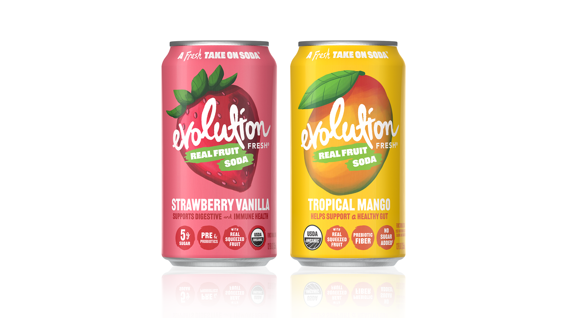
Previous Packaging
The Challenge
The existing packaging leveraged brand equity but lacked clear communication hierarchy and shelf impact. As a result, flavor recognition and key product benefits were not immediately apparent in a crowded retail environment.
The objective was to drive home real fruit ingredients, modernize the visual system while preserving recognizable brand cues, improving clarity, differentiation, and overall premium perception.
strategic approach
The design approach focused on evolving the brand while preserving its core identity. Existing visual equities were retained, while the system was refined to feel more modern and cohesive.
Hierarchy was simplified to clearly communicate flavor, benefits, and brand at a glance, while more prominently reinforcing the product’s real fruit credentials to support its health-forward positioning. The result is a scalable system designed for consistency across SKUs and future innovation.
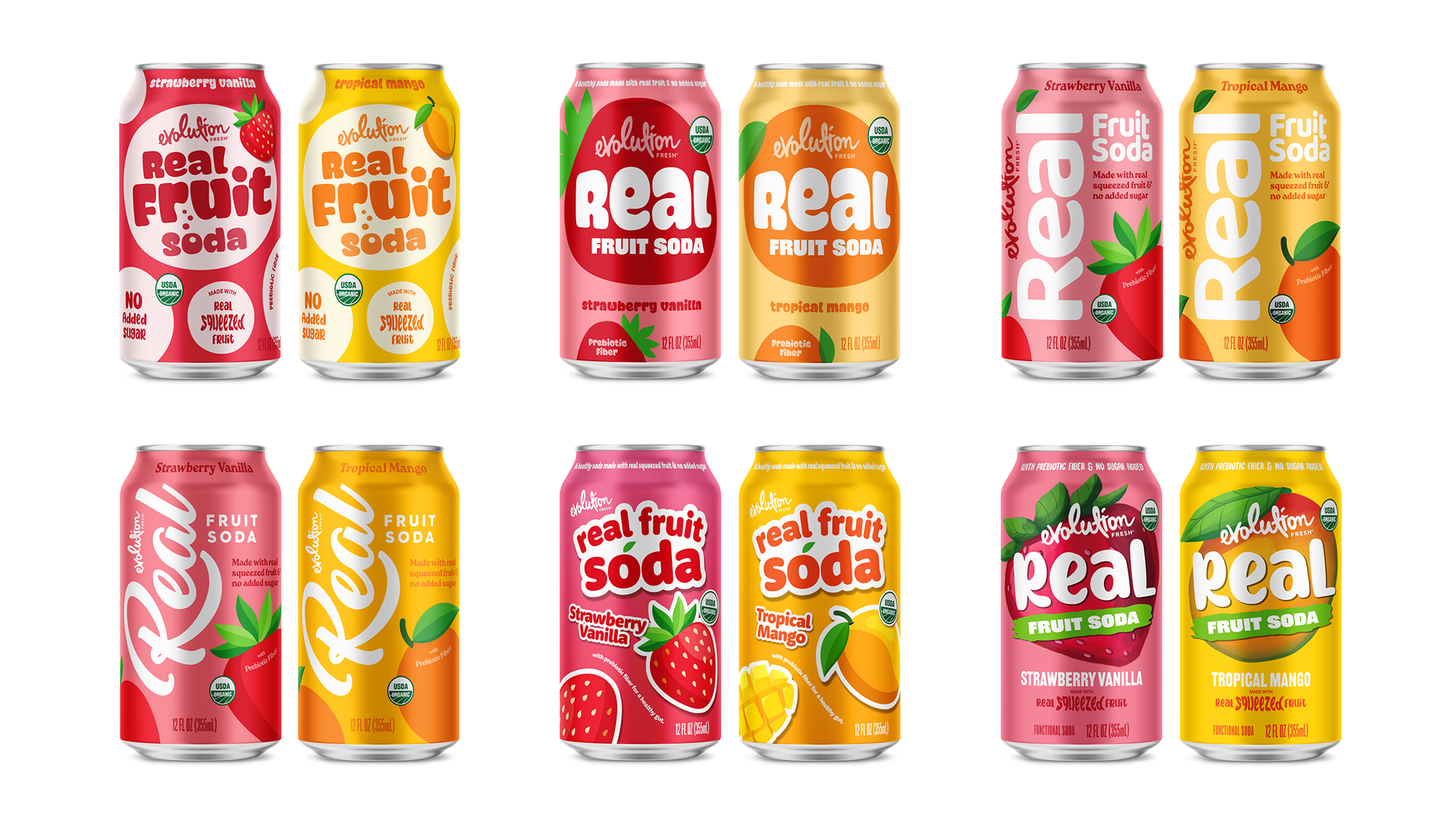
DESIGN EXPLORATION
Multiple design directions were explored to evaluate different approaches to hierarchy, color, and brand expression. These explorations helped identify the most effective balance between maintaining brand recognition and introducing a more contemporary, differentiated visual system.
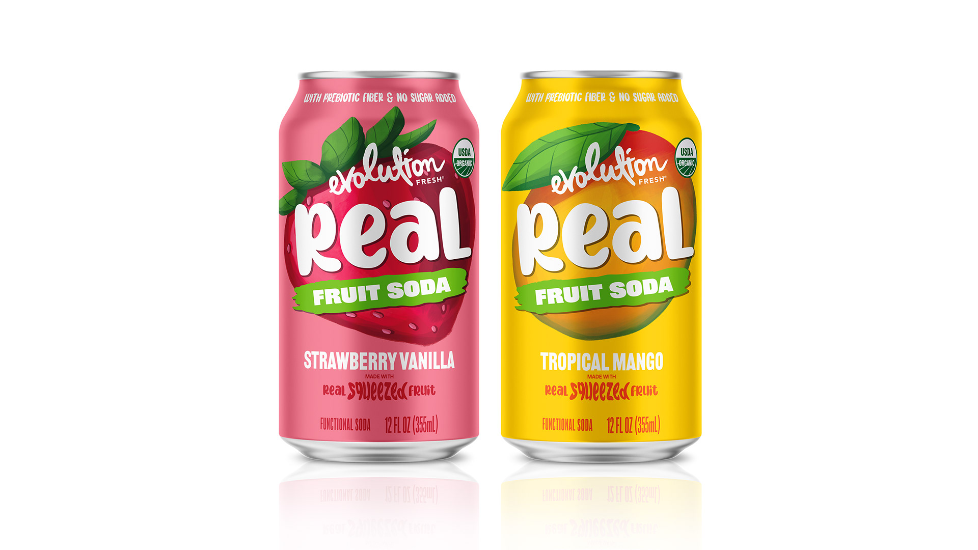
FINAL DIRECTION
The RFS 2.0 direction balances brand heritage with a more refined and modern visual language. The updated system introduces a clearer hierarchy, allowing flavor, benefits, and brand to be understood quickly and intuitively.
Typography and color were carefully adjusted to improve readability while reinforcing a more premium and contemporary feel. The result is a cohesive and scalable design system that strengthens shelf presence and creates a more unified brand block across the product line.
IMPACT / OUTCOME
The RFS 2.0 system elevates overall brand perception while preserving the familiarity of existing brand elements. Improved hierarchy enhances readability and product navigation at shelf, helping the packaging stand out in a competitive environment.
In addition, the system establishes a flexible framework for future innovation, allowing new products to be integrated seamlessly while maintaining visual consistency.
ROLE / CREDIT
As Designer and Art Director, I oversaw concept development, strategic direction, and final design execution for the project.