case study
Introducing a functional tea made with real fruit.
OVERVIEW
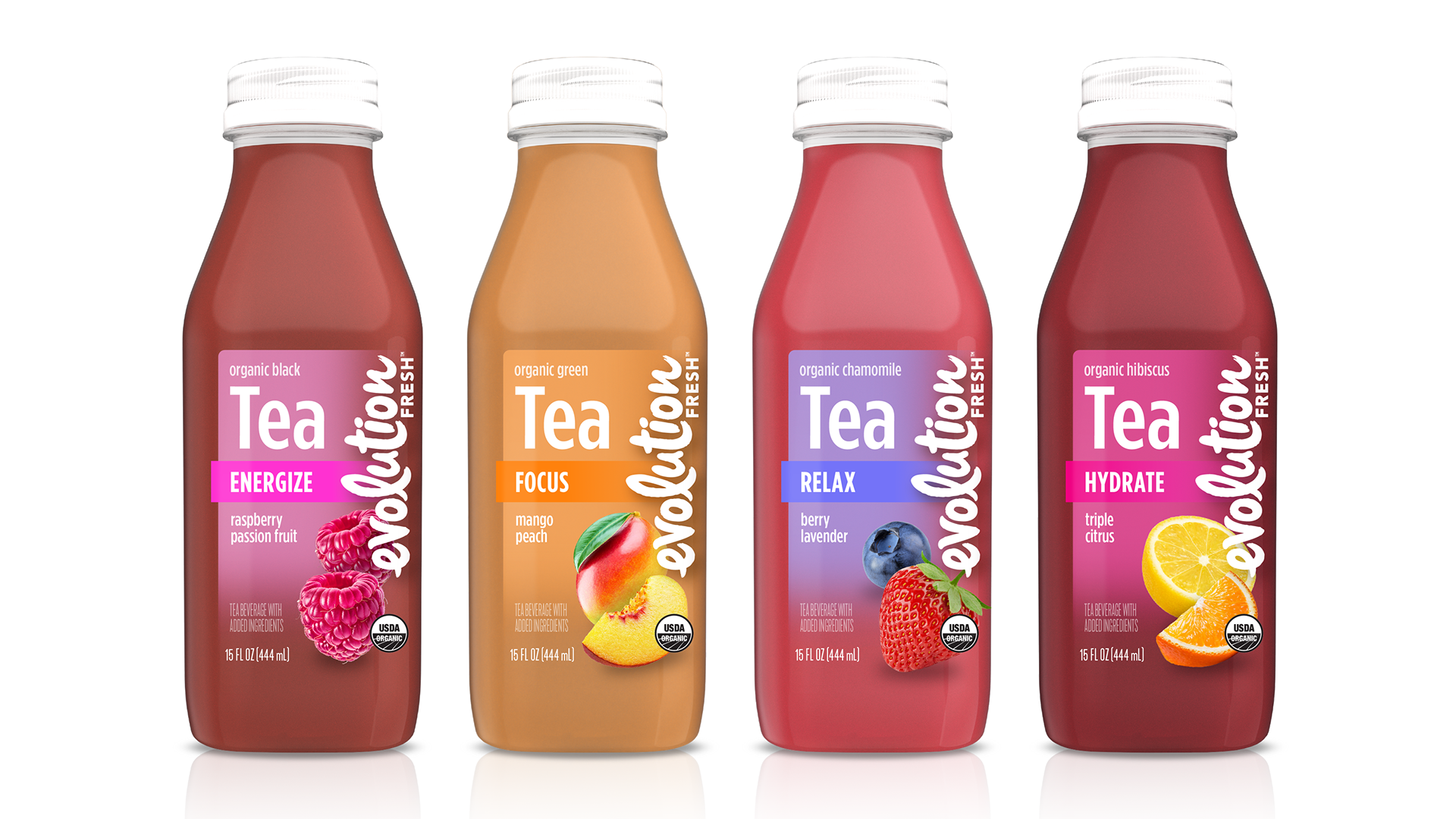
A function-driven tea platform designed to deliver Energy, Focus, Relaxation, and Hydration—combining real fruit with purposeful benefits in a distinctive, premium package.
To expand the Evolution Fresh portfolio, we explored the introduction of a new ready-to-drink tea line made with real fruit.
The goal was to create a product that balanced the brand’s premium, fresh positioning with a clear functional promise—giving consumers an intuitive way to choose a tea based on need state.
THE CHALLENGE
The project required defining both the product identity and the structural design system from the ground up. Key considerations included:
• How to communicate functional benefits (Energy, Focus, Relax, Hydrate) clearly and quickly at shelf
• Whether to leverage existing Real Fruit brand equity or establish a new visual language
• What packaging format best expresses freshness, quality, and differentiation
• How to balance strong communication with elevated, premium design
EARLY EXPLORATION: BRAND + FORMAT
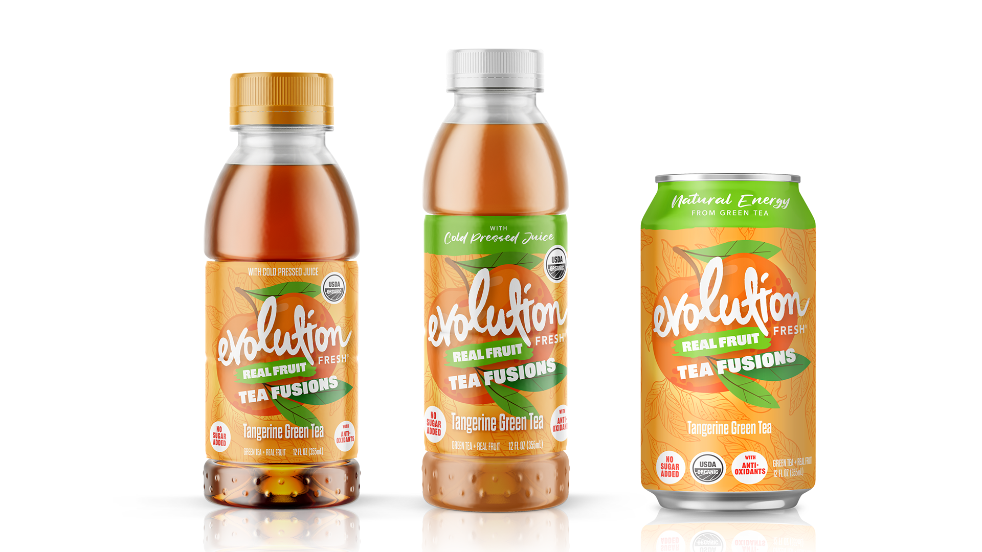
Initial concepts explored two distinct directions:
Leveraging Existing Equity
One approach extended the visual language of the Real Fruit Soda line—featuring bold fruit illustration, expressive typography, and benefit-driven callouts. Functional cues were introduced, but competed with an already energetic system.
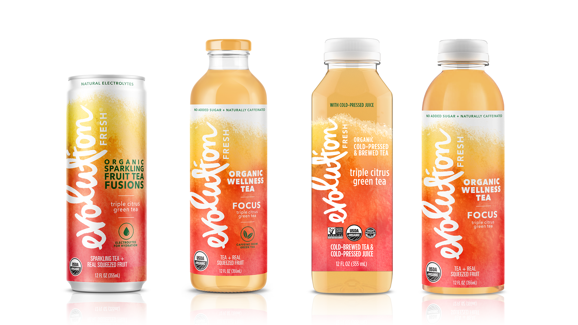
Tea-First Direction
A second direction moved toward a more refined and elevated aesthetic tailored to tea. This approach created more space to highlight function as the primary organizing principle, supported by cleaner layouts and a more premium tone.
In parallel, multiple formats were evaluated—including cans, glass and various PET bottle shapes—to understand how structure could reinforce both function and flavor communication.
Key Learning
The Real Fruit system delivered strong energy, but lacked the clarity needed for a function-based product—highlighting the need for a more focused and intentional design system.
Structural Innovation: Defining the Bottle
The design direction converged on a custom PET bottle featuring a square base and round top.
This hybrid structure was selected to:
• Create a distinctive, ownable silhouette on shelf
• Provide stability and efficient packing through the square base
• Maintain a comfortable, familiar grip with the rounded upper form
• Showcase the product and reinforce freshness through clear packaging
• Provide stability and efficient packing through the square base
• Maintain a comfortable, familiar grip with the rounded upper form
• Showcase the product and reinforce freshness through clear packaging
The bottle itself became a key differentiator—supporting both brand recognition and functional clarity.
Design Development: Establishing the System
With the structure defined, label concepts focused on establishing a system that clearly communicated both flavor and function.
A direction was selected and expanded across four benefit-driven SKUs:
Energize — Black Tea
Focus — Green Tea
Relax — Chamomile Tea
Hydrate — Hibiscus Tea
Focus — Green Tea
Relax — Chamomile Tea
Hydrate — Hibiscus Tea
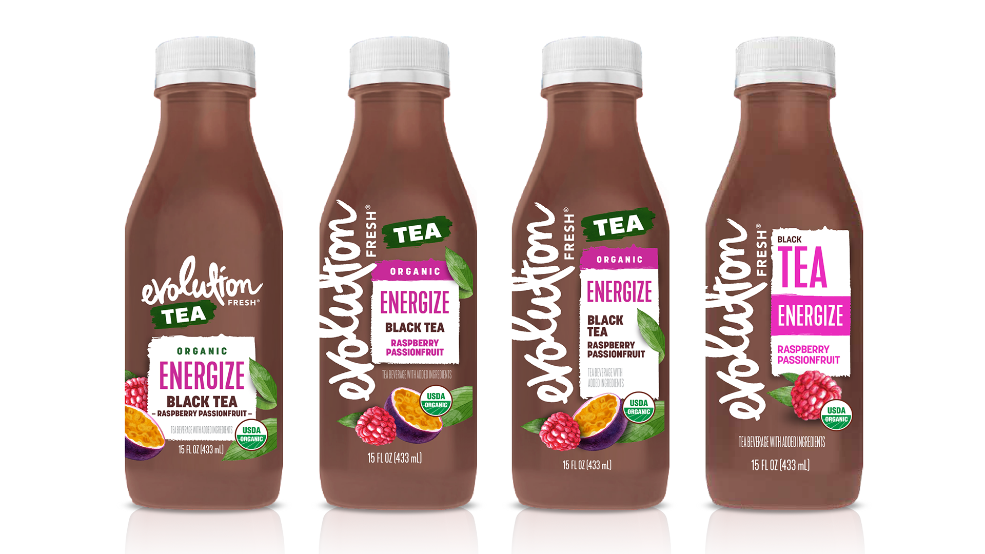
Early executions emphasized bold branding and illustrative ingredients, with functional callouts integrated into the layout.
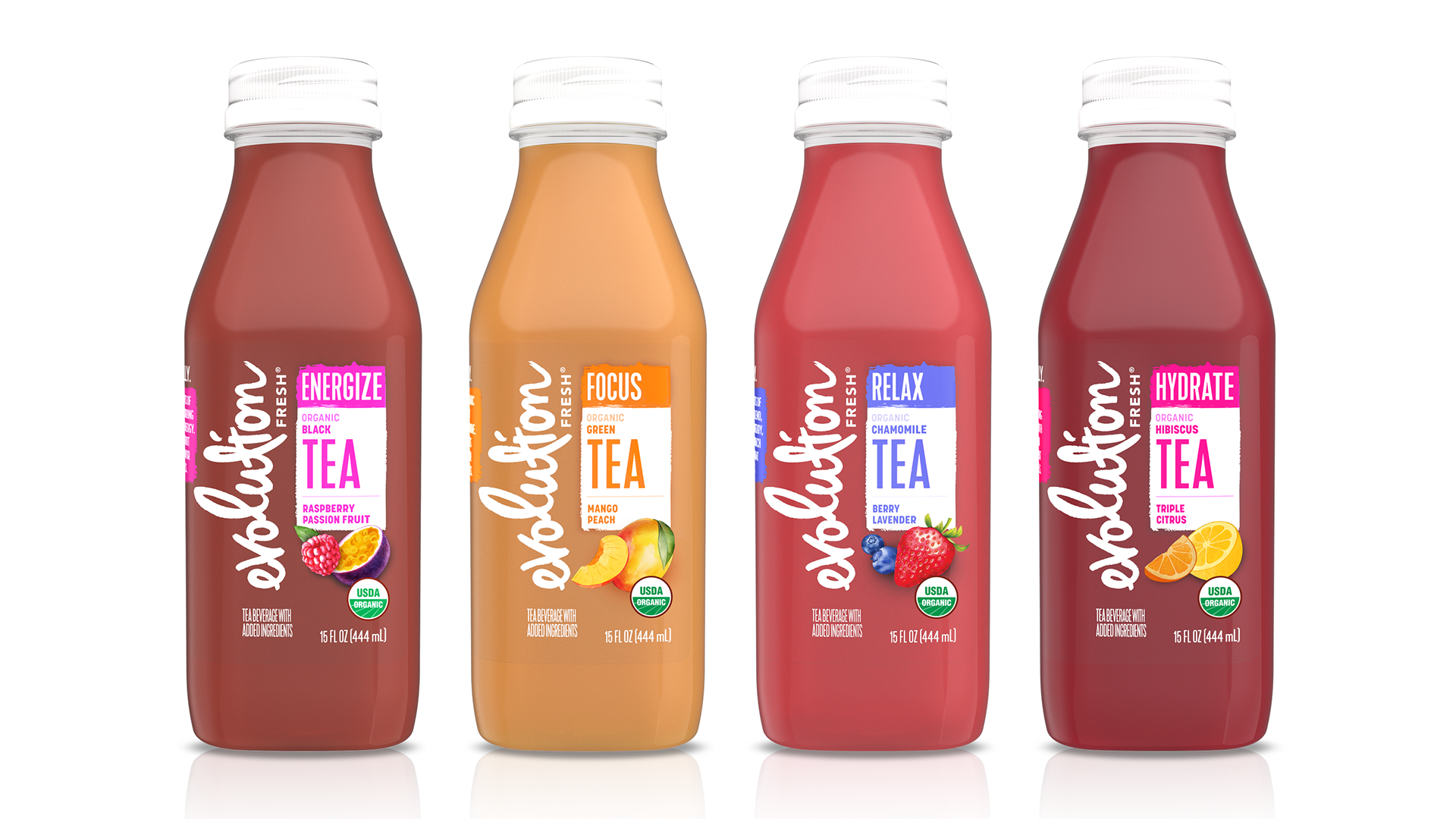
Selected design for initial product launch
BRAND UPDATES REQUIRED IMMEDIATELY AFTER LAUNCH
Following initial production, several opportunities for improvement were identified:
• The new Evolution Fresh structure relocated an updated logo to the right side of the front panel. The older logo (on the left side) was overly dominant, limiting the visibility of key functional messaging.
• Product details and flavor descriptors were too small to read quickly at shelf and legibility could be improved.
• Illustrated ingredients lacked appetite appeal and realism. The overall hierarchy felt dense, reducing clarity and premium perception
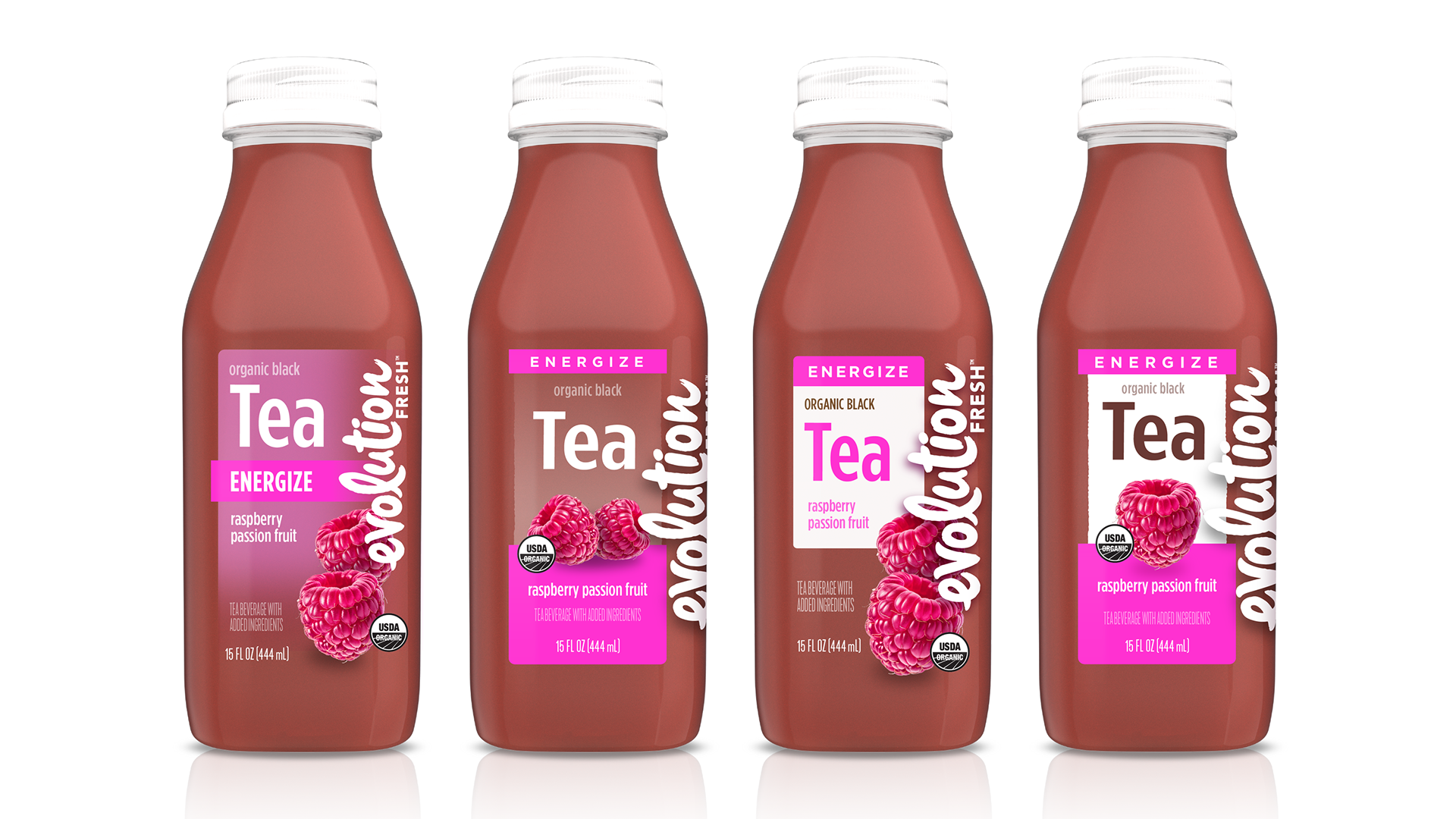
Refinement: Evolving the Visual Hierarchy
The introduction of an updated Evolution Fresh logo created a pivotal opportunity to revisit and refine the label system. Building on learnings from the initial design, exploration focused on improving visual hierarchy, amplifying functional messaging, and enhancing overall appetite appeal.
Multiple directions were developed to better balance brand presence with product communication—prioritizing larger, more legible benefit and flavor cues, simplifying layouts, and evolving ingredient representation to feel more natural and premium.
This phase ultimately redefined the packaging to be more intuitive, scalable, and aligned with consumer expectations.
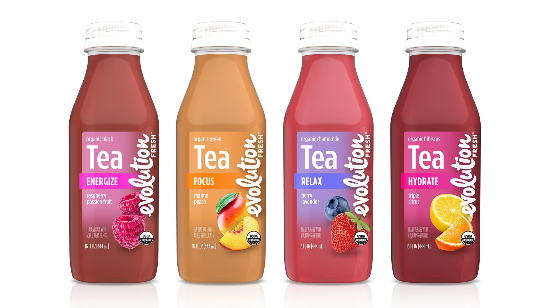
Final Design: Clarity, Balance, and Appetite Appeal
The final design direction focused on simplification and hierarchy:
• Reduced emphasis on the logo to allow key messaging to scale
• Larger, more legible typography for flavor and benefit communication
• Cleaner layouts with improved balance and negative space
• Enhanced appetite appeal through more refined, natural ingredient representation
• Larger, more legible typography for flavor and benefit communication
• Cleaner layouts with improved balance and negative space
• Enhanced appetite appeal through more refined, natural ingredient representation
The result is a packaging system that feels more premium, more intuitive, and more aligned with consumer expectations for modern tea beverages—while maintaining strong shelf presence and brand recognition.
IMPACT / OUTCOME
The final solution delivers:
• A distinctive and functional bottle design
• A clear and scalable visual system across flavors
• Improved communication of benefits and flavor
• Stronger appetite appeal and overall aesthetic quality
• A clear and scalable visual system across flavors
• Improved communication of benefits and flavor
• Stronger appetite appeal and overall aesthetic quality
Together, these elements position the product as a compelling addition to the Evolution Fresh lineup.
ROLE / CREDIT
Lead Designer and Art Director, I oversaw concept development, strategic direction, and final design execution for the project. I established label architecture, typography, and flavor system, and drove iterative refinement based on internal feedback and brand updates.
Other Credits:
• Updated Evolution Fresh logo developed by external agency
• Final bottle structure selected by committee