case study
Single-serve equity translates into high-impact multipack
The Challenge
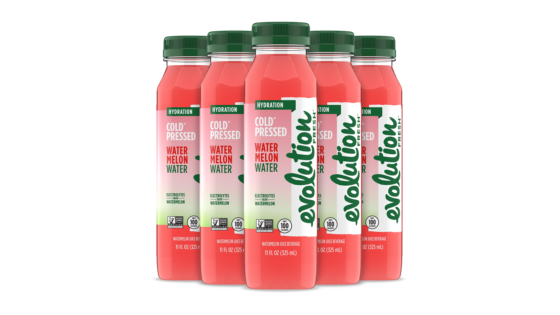
While the single-serve product communicated freshness and quality effectively, the new multipack needed a cohesive system that translated those attributes at shelf.
The opportunity was to create a packaging solution that strengthened brand blocking, improved flavor recognition, and clearly communicated the product’s real fruit hydration positioning in a crowded refrigerated set at club stores.
strategic approach
The design approach focused on extending the core brand into a multipack format while maintaining consistency with the single-serve experience.
Hierarchy was refined to clearly communicate flavor, product benefits, and brand at a distance, while more prominently reinforcing the real fruit credentials to support a fresh, health-forward positioning. The system was designed to scale efficiently across SKUs while maintaining strong visual cohesion at shelf.
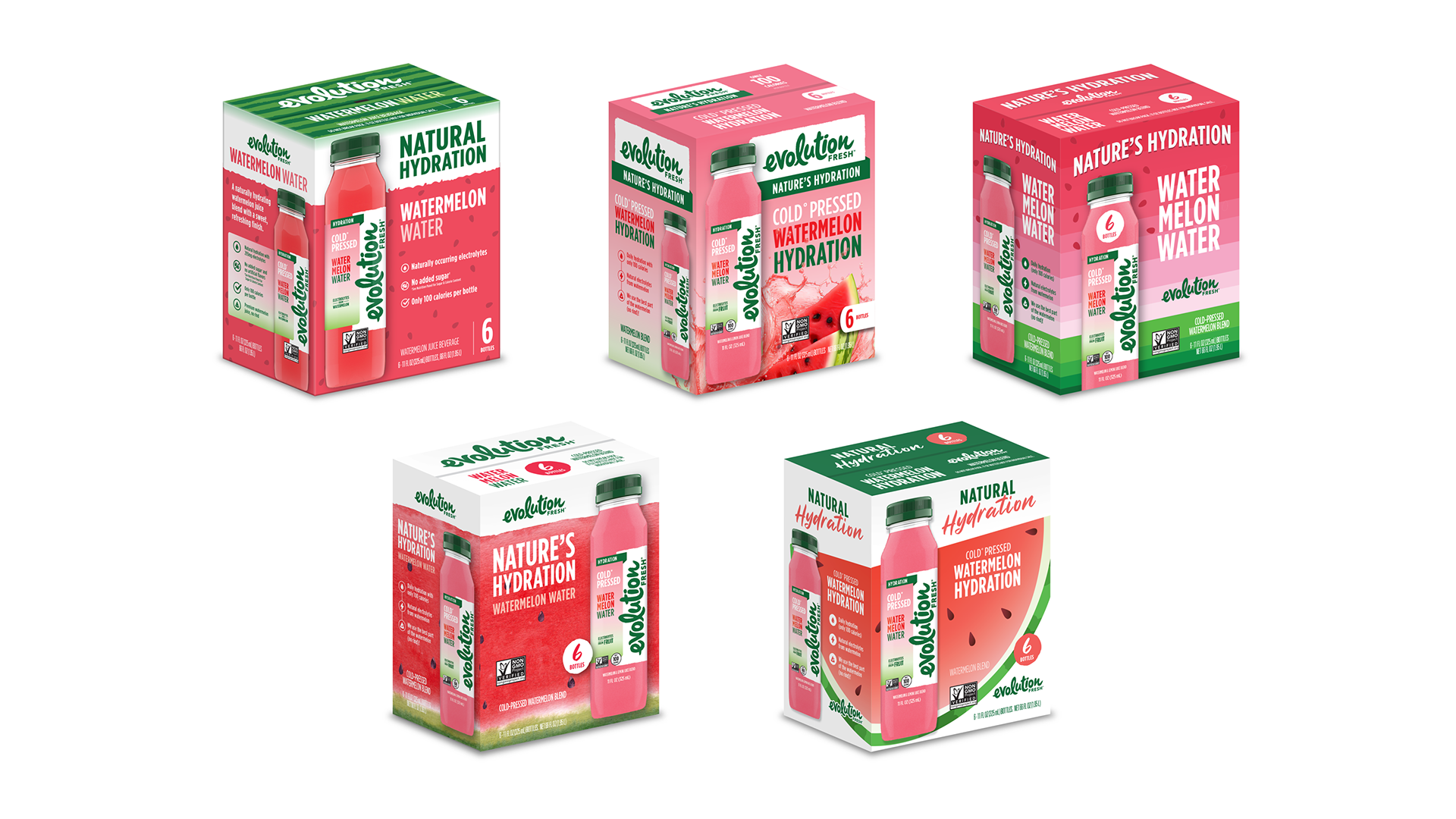
DESIGN EXPLORATION
Multiple design directions were explored to evaluate different approaches to hierarchy, imagery, and brand expression. These ranged from more expressive, flavor-forward concepts to structured, benefit-led systems.
Each direction tested a different balance between emotional appeal and functional clarity, helping to identify the most effective way to communicate freshness, hydration, and real fruit ingredients within a multipack format.
FINAL DIRECTION
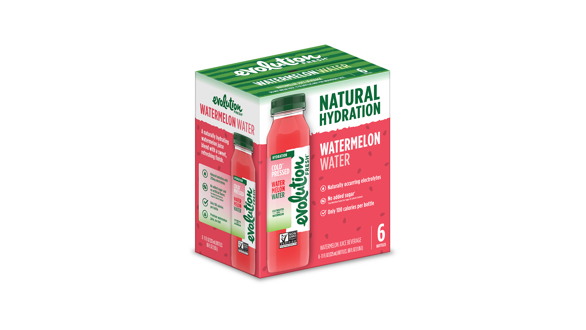
The selected direction builds directly from existing brand equity while introducing a more structured and legible system optimized for shelf impact.
A bold color-blocking approach improves visibility and creates a stronger brand presence when merchandised in-store. The hierarchy prioritizes flavor and hydration cues, while maintaining clear brand identification.
Subtle refinements to typography and layout create a more modern and cohesive appearance, while the inclusion of product imagery reinforces the real fruit story and enhances appetite appeal.
IMPACT / OUTCOME
The final design delivers a cohesive multipack system that strengthens shelf presence and improves product navigation within a competitive category.
By balancing brand familiarity with improved clarity and visual impact, the packaging enhances consumer understanding while reinforcing the product’s fresh, real fruit positioning. The system also provides a flexible foundation for future flavor extensions and product innovation.
ROLE / CREDIT
Lead Designer & Art Director – Led concept development, strategic direction, and design execution for the multipack system. Designed label on bottle and created 3D product render in Keyshot.